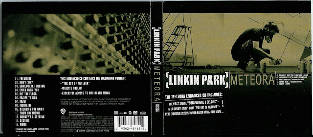
Linkin Park is an American rock band. From the cover we can tell that they are not a pop nor a mainstream band as they have not used any bright colours, and bright colours on an album cover is something you would usually associate with mainstream artists. We can see that they are clearly an alternative band as the cover could be seen as promoting vandalism, and this represents that they are not afraid to take risks. However this could also not be vandalism, it could be someone working on some sort of creative project, and I feel that the band want the audience to be left in the dark as to what the image actually shows.
The artists are not on the front cover. This could be because they were already a very famous band when this album was released, and they felt that they did not need to advertise themselves as they already had a very wide fan base, and they were happy with that. They could also be going for the creative approach to an album cover, which I feel actually works because it gives scope for different interpretation, as does their music.
The album is entitled 'Meteora'. If you look up the definition of the word it is a complex of a monastery in Greece. In Greek it also means "In The Heavens Above". It is unknown to the audience whether or not the group based the album on the definition of the word or whether they simply liked it. The word will not be well known to the audience and therefore it could mean different interpretations could take place, or people may simply overlook it.
The setting of the actual image could be in many different locations; however I believe that it is in a studio. The character in it looks like a professional graffiti artist who could be doing some work for the band. Another interpretation could be that the band just wanted an artistic or powerful image to appear on the cover and they set the whole thing up for advertising purposes. From a distance it looks like someone crouching on the end of a wall, and this kind of optical illusion goes with the mystery that the band have already presented through the name that their main target audience will not know about and the picture that people cannot decide what it is. The band is represented as being young as this kind of art work is mainly appreciated and carried out by young people. They are not actually seen on the cover and therefore are obviously not image focussed. They would probably say "we try to focus on the music" or something very stereotypical to the rock genre.
The use of an almost sepia tone throughout the image provides us with an authentic picture that the audience can recognise. This also shows simplicity and originality to the group, which is how some of the best music is created. It shows that they do not need to hide behind any fancy images or colours on their album and they can almost be 'stripped back to basics' and that they are purely who they want to be. Costume on the figure is dark which goes along with the tone of simplicity as it is black and there are cables on the floor and this shows that the band are not too safety conscious and this could relate to their music as well, as if they do not mind taking risks.
The Layout of the whole digi pack is quite simple even though the background images are not but this contrast between the simple layout and the extremely stylised background is actually quite an interesting one. On the front cover there is quite a lot of text; more than your normal amount. This is one of the only album covers I have seen that actually has the track list on the front, as small as it is. All of the different pieces text on the front are completely different fonts and this is also not a usual thing you see on an album cover, but the bands alternative style music, that tries to remain different from anything else, shines through on this digi packs front cover with the varying fonts. The back cover on the other hand is pretty conventional compared to the front as all of the text is the same (excluding the small print). I think this has been done to try and bring a little bit of consistency to this otherwise all over the place album cover.
I believe the target market for this digi pack is young people, as it means that they can interpret it with their young minds. Also it contains graffiti or artwork and this is mainly appreciated by younger people.
Post By:
Josh Barrett

-2003-(album_cover)-fnt.jpg)
No comments:
Post a Comment