
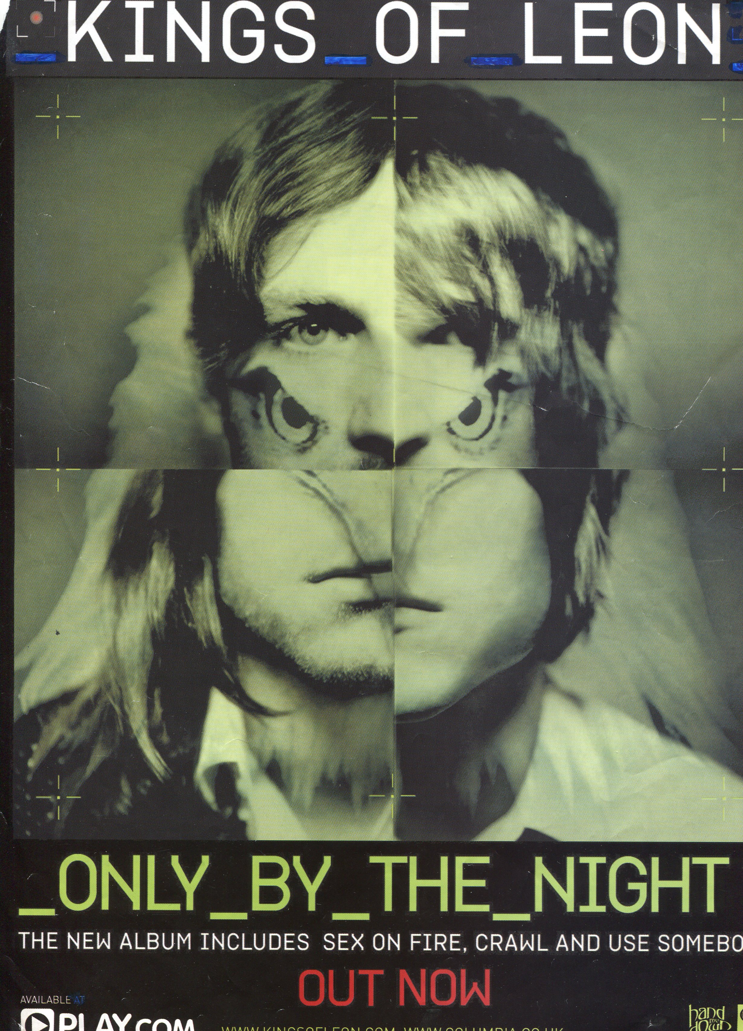
This is the magazine
advertisement for Kings of Leon’s album 'Only By The Night' which was released
in September 2008. It was the fourth studio album that the band and it reached
#1 in the UK album charts. What's most noticeable in terms
of the composition on this advert is the large image in the middle which is
what was also used for the album cover. Here they've mixed and blended in four
portraits of the band members with an image of a bird of prey. Not only does
this symbolize the band as a close group/family, it also symbolizes their
success and ability similar to an eagle ‘soaring through the skies.’ I can see
that the image intends to give a serious effect on its viewer as the eyes of
both artists and the bird are staring right at you as you look at the advert. One
thing that I noticed with other album advertisements in a similar genre is that
nature springs up regularly, and it is a key theme here. Likewise the faded,
vintage look and in this case folded, is something that appeared on a Razorlight
advert suggesting it's a generic convention of trend as this and the Razorlight
album were released at a very similar time. Continuing to look at the main
image I like the colours used. It looks like a vintage sepia effect that runs
parallel with the faded and worn effect creating an overall theme that is hard
to ignore.
Moving onto the text. It contrasts with the background image
and overall style in an interesting way. The capital, digital serif font has
been used, which shows it’s seriousness and quality rather than a flashy
message with curly text. The font in conjunction with the underscores produces
a modern almost futuristic look. The white and blue colours used for the bands
title stands out amongst the dark background. Likewise the album name follows
suit with the neon green finish. One complaint I have is how the line below
that is quite wordy. On other posters the would state its a "new
album" on a separate line to the singles. This is even more poignant on
this advert where there were three singles released before the album itself.
Furthermore below that they have "out now" written in a large font. I
think this highlights the need for concise text on adverts. There is no need to
repeat themselves so they could have dropped it from next to the singles and
made the font bigger there. On the other hand one thing I do like is the drop
of red used here. Red naturally jumps out to audiences so when used in
moderation can make features stand out. Personally I believe that using it on
the band’s name would have been more prominent.
This advert is a perfect example of an advert that contains
heavy synergy throughout its advert, music video and album cover, all three
showing a strong message of how the band are unified as one. The font also
comes in three different sizes on this advert, we have a larger size font for
the band’s name and album name, this is to aid the advert in its aim of
informing readers that the band has a new album, we then have a smaller font
used on the words OUT NOW, this has been made the second most focal text on the
advert to achieve the aim of informing the readers that the album is out now,
and finally we have a smaller font used on the text ‘THE NEW ALBUM INCLUDES SEX
ON FIRE, CRAWL AND USE SOMEBODY’ this has been done to achieve the third aim
which is to inform the reader of brand new tracks released with this album.
Finally in the bottom left I can see how the advert has
included the logo of the distributor ‘play.com’ this has been done purposely to
increase sales for both the distributor and the band, if a reader is to view
the advert they may be very interested, and this would mean the advert has had
its desired effect on the reader, making them feel like they would enjoy and
would like to buy the album, however the advert then needs something to push
the reader to actually make action on this thought and actually buy the album,
in this case it is the use of the distributors logo to do so. This logo which
is also very well-known instantly informs the reader where to purchase the
album from, the next time the reader is on the PC or see’s this logo, it may
then push them to either buy the album from their website, or trigger their
memory about the advert, which then reminds them that they wanted to purchase
it.
Post by:
Josh Barrett
No comments:
Post a Comment